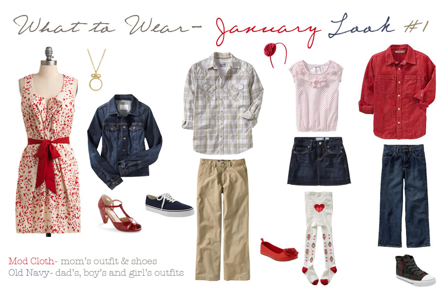
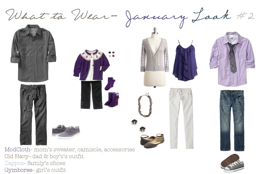
I can’t believe we are getting ready to welcome a new year...2012 was a complete whirlwind and more than ever, I am SO excited for 2013! I have several portrait and engagement sessions coming up in this wonderful winter-wonderland that we are currently experiencing and I wanted to share some ideas on how to coordinate without being too matchy-matchy this winter. Colors are everywhere around us and bring things to life… why not bring your images to life as well! Be sure the colors you use coordinate with each other and you don’t just end up looking like one big rainbow family! When picking patterns, choose smaller ones that won’t distract attention away from the main subject/s. Use patterns sparingly…if one person is wearing a print, try to avoid putting someone else in a competing pattern. When thinking about texture, choose different ones that will give photos some interest such as lace, corduroy, denim, etc. Avoid large logo’s, emblems and graphics like “GAP” and “Old Navy” because again, these will typically distract attention away from the subject. We want your faces and emotion to show, not promote the clothing company you purchased from! Thanks again to Corina Nielson for the guides!


